economics, history, humor, oversimplify, politics

Twelah of Stonina

No, the title is not the name of a character in a dreary fantasy epic.  It links 2 examples of something that can happen to oversimplifications as circumstances change: what is initially harmless (and perhaps mildly beneficial) can become pernicious.
(BTW, the [Menu] button atop the vertical black bar reveals the widgets.)

As in my earlier post arguing that oversimplification is unavoidable but can be done honestly, a whimsical example that is easily understood breaks trail for a serious example that is not.

1. Puzzles

Instructions for puzzles usually explain what the solution should look like, w/o constraining how to get there.  The Jumble series of puzzles has been around for decades, originally just on printed pages but now online also.  I sometimes solve the puzzle as printed in my daily newspaper.  (Yes, I am that old.)  Taken literally, the instructions for a Jumble do constrain the how, but in a way that strikes me as a harmless oversimplification in explaining the what.  More precisely, it was harmless until the series went online.

The weird words in the title of this post are scrambled versions of the ordinary words wealth and nations.  A typical Jumble puzzle invites the reader to unscramble several such scrambled words and then use the letters at some specified positions in the ordinary words to complete the caption of a cartoon.  Printed and online versions of the puzzle for 2016-06-10 are displayed below.  Both the layout and the use of “Now” in the printed instructions indicate that unscrambling comes before completing.  Similarly for the online instructions revealed by the [HELP] button.

2016-06-10_E23_Jumble

While I sometimes proceed in the instructions’ order, I more often guess the completion before unscrambling all (or even any) of the words.  So what?  I can put my pen anywhere on the page at any time.  The sequencing in the instructions is just a convenient way to explain what would be a solution to a Jumble puzzle.  One could rewrite and reformat the instructions so as to explain that w/o extraneous sequencing (as in the instructions for Sudoku), but it is not obvious how to write sequence-free instructions for Jumble that are as clear as the oversimplified instructions with extraneous sequencing.  Why bother?

Here’s why.  Look at the online version.  That bright green square is a place for typing, if U so choose.  The interface does a good job of allowing U to drag letters rather than type.  After unscrambling all the scrambled words, U will see the available letters appear above the caption and can type or drag to complete the caption, just as U typed or dragged when unscrambling.   While the interface displays several signs of  good software engineering, it takes the informal specs too literally and mandates the heuristic of unscrambling all the words before doing anything to complete the caption.   (Being a nerd myself, I can sympathize.)   What began as a harmless oversimplification became a killjoy.

As it happens, I started by guessing the caption for the 2016-06-10 Jumble, then verified that my unscramblings of 3 words were consistent with my guess, and then used the resulting tentative knowledge about letters to be contributed by the word still scrambled as a hint about how to unscramble it.  (A tiny example of how science works.)  No can do in the online version.  There is a [HINT] button that doles out a single letter in a single word.  My preference for making my own hint is not just a consequence of my being compulsively self-reliant.  My own hint is discovered and might be misleading because I might have guessed wrong at the start.  The online hint is an infallible gift from on high.  No fun in that.

If U want to work on the online version of this particular Jumble, U can click on its image to visit a page with today’s puzzle and then use the page’s calendar widget to go back to 2016-06-10.

Now it is time for the serious example, which starts in the same century as the scene depicted in this example, but on the other side of The Pond.

2. Free Markets

The other momentous document published in 1776 was Adam Smith’s The Wealth of Nations, with a then-harmless oversimplification that has become a now-pernicious dogma.

Smith’s readers were familiar with intrusive governments and quasigovernmental organizations like craft guilds.  Mercantilist governments restricted who could sell what to whom.  Guilds set the prices of what their members made.  That was normal, as was censorship, state-sponsored religion, and commercial privileges granted by royal whim.  Smith was aware that his readers might find his free-market ideas disturbingly anarchic, and he tried to reassure them with his famous fantasy about an invisible hand.  He succeeded too well.

Smith remarked that, while he advocated much less intrusive government than his readers considered normal, there were still important government functions needed to make his free markets work.  He mentioned some explicitly.  Unsurprisingly, he did not mention those that would not be on anybody’s radar for over a century.  Markets cannot work properly w/o transparency: potential buyers need to know what they would be getting and how much they would be paying.  Apart from providing a trustworthy money supply, there was no obvious need for laws and regulations to make markets transparent.  They seemed obviously transparent; nobody wearing a 3-cornered hat noticed that transparency was being assumed and might someday need to be enforced.

With the passage of time, Smith’s ideas took hold, the economies of his nation and ours grew richer and more complex, and economists eventually realized that markets cannot be perfectly transparent.  What happens when they are seriously opaque?  When getting pertinent info is costly?  When some of the info floating around is false?  When insiders have pertinent info that they act upon but keep to themselves?  Long technical answers won Nobel Prizes for Kenneth Arrow and Joseph Stiglitz.  The financial crisis of 2008-2009 and its precursors illustrate a somewhat oversimplified short answer that suffices for present purposes:

The shit hits the fan.

By the time the importance of transparency and the need for laws and regulations that enforce it had become common knowledge among thoughtful advocates of free markets, the invisible-hand fantasy had morphed into market fundamentalism.  That dogma is a godsend for anybody who wants to act like a psychopath but suffers from the inconvenience of having a conscience.  It is OK if I scramble to enrich myself and U scramble to enrich yourself, no matter how much we harm each other or anybody else.  If the stupid gummint stays away and just lets “The Market” work its magic, everything will come out as well as possible in the real world, where resources are scarce and buying anything precludes buying something else with the same money.

Like religious fundamentalism, market fundamentalism is rigid, simplistic, and oblivious to the suffering it causes.  The real world is indeed harsh.  It is also vastly more complex than fundamentalists concede, perhaps more complex than they can imagine.  Enforcing fairness and transparency w/o stifling useful innovation is not easy.  More generally, finding a good balance between public and private economic activity is not so easy as it seems to market fundamentalists (or to socialists, at the other extreme).

Much longer (but still readable) discussions of opacity and other market failures can be found in books like The Roaring Nineties by Joseph Stiglitz.  Perverse incentives lead to perverse behavior.  Is that really surprising?

ethics, humor, oversimplify, philosophy, politics

Green Grass and Golden Rules

Like overeating, oversimplifying is something we should always try to avoid.  Oops, that’s an oversimplification.  Sometimes it is harmless (or even helpful, for certain purposes or as a temporary expedient) to oversimplify; sometimes it is hardly better than lying.

Is grass green?  Not if it’s Japanese blood grass in autumn.  Does a bear shit in the woods? Not if it’s a polar bear.  Is the sky blue?  Not at 1:00 AM.  Something important is hiding in plain sight here.  Everybody and their uncle have always known counterexamples to the claim that the sky is blue, and some of them have been celebrated with striking photos.  On the other hand, when cartoonist Garry Trudeau wanted to poke fun at reflexive Republican opposition to anything proposed by President Obama, he used this same claim in the Doonesbury strip that appeared 2015-05-24 in my local paper.  Clinging to his tattered hope for bipartisanship, Obama responds to an aide’s disillusionment by announcing something he thinks will be utterly uncontroversial: that the sky is blue.  The last panel shows a subsequent press conference held by the Senate’s Republican majority leader.

Reporter:
Leader McConnell, is the sky blue?
McConnell:
I am not a meteorologist.

Whether or not U agree with Trudeau’s take on the attitudes of those who pass for Republicans nowadays (and whether or not U found the strip funny), I trust that U did recognize the question about the sky’s color as a more polite version of the question about ursine defecation.  Even tho U know about sunsets.  Even tho U know that everybody else knows about them too. What is going on here?

1. Everything Is Oversimplified

belted-galwaybelted-galway-brown
Well, not everything.  The black and white cattle living on the farm near my house are not oversimplified.  They just are what they are.  Much of what I might say about them is oversimplified.  Indeed, it is hard to find anything nontrivial to say about them that is just plain true (like 2+3 = 5), w/o any qualifications or exceptions.  From a distance, they are black and white cattle, lounging on green grass under a partly blue sky.  Look more closely, and a few of them have brown instead of black.  Does it matter? Not to me.  Maybe it would matter to somebody who breeds Belted Galloway cattle.  I just admire the bu-cow-lic scene and stay upwind.  Does a cow shit in the pasture?

Overeating is something people often do.  They should always try not to, and many of us can succeed most of the time.  Oversimplifying is more complicated.  Sometimes it is harmless (or even helpful, for certain purposes or as a temporary expedient); sometimes it is hardly better than lying.  Trying not to oversimplify is generally good, but the cure can be worse than the disease.  It may be better to oversimplify, be honest about it, and remain open to working on a more accurate formulation as the the need arises.  A more accurate formulation may well be good enough for a long time, but not forever.  Scientific theories and engineering calculations are like that.  Guess what?  So are ethical principles.

2. Why Is “Golden Rules” Plural in the Title?

What we call “the” Golden Rule has been formulated in various ways by various cultures.  A nice discussion appears on pages 83-86 in the book Plato and a Platypus Walk into a Bar by Cathcart and Klein.  (The book is a great read, even if U aced Philosophy 101 and have already heard many of the jokes.)  They use an old joke to illustrate how seriously oversimplified the rule is:

A sadist is a masochist who follows the Golden Rule.

It gets worse.  Even when how people like to be treated is pretty much the same thruout a group, the Golden Rule stumbles.  I was both amused and disturbed when cartoonist Scott Adams showed how badly it stumbles in a Dilbert strip I should have saved.  The boss proclaims that company policy will henceforth be to follow the Golden Rule.  Dilbert objects; the boss asks why.  The resulting exchange goes something like this:

Dilbert:
Would U like me to give U $100?
Boss:
Um, yes.
Dilbert:
OK, follow the Golden Rule and give me $100.

The boss is reduced to sputtering indignation.  Dilbert is clearly taking the rule too literally and ignoring an implicit consensus about exceptions.  But what are they?  I could not say where Dilbert errs.

Most of the formulations discussed by Cathcart and Klein are somewhat clunkier than our culture’s usual

Do unto others as U would have others do unto U.

They amount to saying

Do not do unto others as U would not have others do unto U.

Maybe people thought of the Dilbert objection and tried to get avoid it by prohibiting X rather than mandating Y.  This does help, but there is still a problem.

Dilbert:
Would U be disappointed if I refused your request to give U $100?
Boss:
Um, yes.
Dilbert:
Please give me $100.
Boss:
No.
Dilbert:
 I see.  U are just as hypocritical about the Confucian version of the Golden Rule as U are about our usual version.

If U fall off a boat and I hear U shout a request to be thrown a life preserver, I will try to do just that.  Just don’t walk up to me and request to be given $100.  What is the difference?  People can start with our usual formulation of the Golden Rule, admit that it is grossly oversimplified, consider what seems reasonable in thought experiments like this, try for a more explicit consensus about exceptions, and remain open to considering more adjustments as more situations arise, either in practice or in thought experiments.  Can we do better?

Immanuel Kant tried valiantly to do better with his Supreme Categorical Imperative, which is a fun read if U like reading tax laws or patents.  Cathcart and Klein have the details.

As a former wannabe mathematician, I would very much like to see a nice crisp formulation of the Golden Rule (or of any other important general principle) that just nails it, w/o exceptions or vagueness.  Nice work if U can get it.  If I ever get stuck with trying to help socialize a child, I will give the kid our usual version of the Golden Rule, say that it is a great starting point for thinking about how to behave, admit that real life is messier, and offer to talk about it more as the need arises.  I will not mention Kant.

humor, language, parody

Megawatt Smile

U can understand this post w/o actually seeing the short skit that inspired it.  After a note on the subtlety of what is or is not offensive, we end with a parody of a familiar song.
– Gray button (upper left corner) reveals widgets, –
– above post (on phone) or beside it (on desktop). –

Megawatt SmileThe image at right is a severely cropped screenshot from a video of a short skit involving thongs and silly raunchiness (or raunchy silliness).  The skit is no longer online, but U can understand this post (and maybe get a laugh at the end) w/o actually seeing the skit.

Tho not offended by the skit itself, I was briefly offended by some accompanying verbiage:

would you let your girl make money on the internet??? fellas answer now

At first, I read the word let in the sense of permit and bristled at the notion that permission is theirs to give or withhold.  Then I realized that let could have been meant in the same mild sense as

Live and let live.

and decided to give whoever wrote the verbiage the benefit of the doubt.

In addition to providing a glimpse of a megawatt smile (with longer looks at other features) and a little comic relief from the US politics train wreck, the skit inspired me to write a parody of a familiar seasonal song.  U can see the parody by scrolling down.  Fair warning: leave now if U dare not risk thinking of the sexually exuberant parody whenever U hear the song in December.

Keep scrolling …
Almost there …
Now … yes … ooooh …

Jiggle buns; jiggle buns; jiggle all the way.
Oh, what fun it is to ride on a girl who likes to lay.

Pushing thru her slit,
on a girl who likes to lay.
Pressing on her clit;
thrusting all the way.
Bed sheet getting wet
as she hugs me tight.
What fun it is to kiss and pet
and lay again tonight.

enlightenment, flowers, history, humor, language, photography

Lion’s Tooth

I like the scattered violets that appeared in my lawn some years ago.  In the spring I let the grass get high before I mow, so that the violets will have a good chance to set seed.  The delay also gives the dandelions a good chance to set seed.  Fine.

DandelionViolets

Would the dandelion have a better rep if we had translated (rather than anglicized) the Old French name?  Not likely.  Every flower is the same bright yellow, so there is no variation for plant breeders to coax toward white or red and then offer “Snow Ball Lion’s Tooth” or “Fire Ball Lion’s Tooth” in seed catalogs.  Any klutz can grow dandelions, so they give gardeners no bragging rights.

Nowadays the French have a derogatory-sounding name for dandelions.  Were the royal gardeners frustrated by the plant’s defiance of the oppressive formality of the plantings at Versailles?  The Germans have kept the good old phrase “lion’s tooth” (in their own language, of course), as have the Italians and the Spanish.  If it ain’t broke, don’t fix it.

When many people see a dandelion, they see a weed.  I don’t.  I see Löwenzahn, the Wagnerian Heldenblume that thrusts green and gold into the grayest and grimmest of our cityscapes.  I see Dent de Lion, the Enlightenment philosophe whose call for liberty and rationality rides the wind.

DandelionSeeds_few

I do pull weeds; I do not pull dandelions.

Flower of the Day – July 20, 2018 – Dandelion

– Gray button (upper left corner) reveals widgets, –
– above post (on phone) or beside it (on desktop). –
engineering, humor, philosophy

How My Blog Became Phone-Friendly

The tweetable answer is that I switched to the Satellite theme.  U can get a wry take on the sometimes quirky path of progress by reading the rest of this post.
(BTW, the [Menu] button atop the vertical black bar reveals the widgets.)

The tweetable answer is that I switched to the Satellite theme.  There are more things in heaven and earth than are dreamt of in Twitter’s philosophy (and I don’t tweet anyway), so U can get a wry take on the sometimes quirky path of progress by reading the rest of this post.

When I started blogging, I wanted a genuinely uncluttered theme that would leave me free to concentrate on content and decide whether I wanted to continue, w/o paying upfront with $ (for a premium membership) and with time (spent customizing).  I wanted black text in a sans serif font on a white background, with lines long enough and vertically separated enough for a readable brief essay w/o too much scrolling.  I also wanted something that was (and still is?) rare among uncustomized themes: I can print out a preview of a draft, get hard copy that looks very much like what the browser displays, and scribble notes about revisions.  Yes, I am that old.

Browsing the theme catalog was a dreary experience, and I found that the only good way to see what my own stuff would really look like was to adopt a theme temporarily and hope nobody was turned off by how ugly my blog was before I found and switched to something better.  After several false starts, I settled on Academica.

A post on Horizon Feedback on 2015-09-14 asked users to beta test changes to “the” WordPress.com editor (the “Beep-beep-boop” editor reached from the WordPress interface with a blue top bar).  Tho I usually used the other editor (the “Classic” editor reached from the WordPress interface with a black top bar), I decided to help out a little.  Improvements in “the” editor might lead me to use it more and enjoy the nice colors.

I started drafting a post, observed the result of clicking the [Preview] button, and submitted a comment including the complaint that

What comes up … is horizontally truncated, with the 1st letter of each line flush against a sky blue border on the left and the last few letters of each line hidden under a vertical scroll bar for the frame containing the draft purportedly being previewed.

Sheri at WordPress looked into the problem promptly and found that it was 2-fold.

  1. The preview was coming up in tablet mode, with no provision for changing the mode to either desktop/laptop or phone.
  2. My theme was not responsive to the kind of device (desktop/laptop, tablet, or phone?) in use.

Sheri and friends fixed #1 soon after, adding buttons that would let a blogger working at (say) a desktop/laptop see how the previewed post would look on (say) a phone:

PreviewButtons

Fixing #2 by switching to a responsive theme would of course be my responsibility, and now I could see how utterly unreadable my posts were to anybody browsing on a phone rather than a real computer.  Remembering how dreary theme shopping was, my initial reaction was curmudgeonly.  I was writing for people who use real computers, not people who surf while standing in line at Starbucks, so I would stay with Academica.

On the other hand, I can remember when the only real computers filled rooms with refrigerator-sized boxes and ran up huge electric bills for power and cooling.  I have also been a frequent visitor to a nursing home and noticed that the aides could sometimes get a brief respite from their jobs by enjoying things like cat videos on their phones.  However unlikely it was that an aide might want to read my blog on a quick break, they should not be forced to look elsewhere just because I am an old fart with an unresponsive theme.  So I resolved to fix #2.  Someday.

When someday finally came in 2016-04, I found that theme shopping is easier now, with a preview capability that lets me see how one of my own posts would look on a phone rather than just how a demo would look on a computer.  I also had plenty of my own posts to play with.  With some experience in blogging, I was willing to forego printed previews.  I could tolerate crappy printing and be content with a theme whose perversities in displayed pages either were minor enough to ignore or could be worked around by adding attributes to a few HTML tags.  (As a frugal Yankee, I still wanted to avoid paying for extensive customization unless I actually needed it.)  Several themes looked OK until I saw what they did to block quotes: they maimed them with an ugly distracting decoration.  I was a big user of block quotes and did not know how to work around this sin.  I did know how to work around Satellite’s sin of using an absurdly light font color for block quotes, and I can bypass the use of a similar font color for my tag line by not having a tag line.

So I switched to Satellite and went over all my posts, retrofitting them with a few workarounds, a few small unrelated updates I had been intending to do someday, and a few small wording changes to make the flow of text around narrow images look good on all devices.  Only 1 post required nontrivial rearranging to look good on a phone.  The whole process took roughly 4 times longer than I had expected, as is common in software engineering.

MenuButton

There is a great virtue of Satellite that should be mentioned: the retractable sidebar.  Apart from the click-me-for-a-menu button at the top, the retracted sidebar is an unobtrusive black band along the left side of the post.  Clicking that button reveals widgets like the [Follow] button and the Search box.

SearchGreenFuzz

Press the [Enter] key after entering a few words, and U will get a display of that search’s hits.  There is just 1 hit for the specific words illustrated here:

TrojanHorse

Clicking on the title of that search’s single hit will visit a whimsical introduction to one of the 20-th century’s epistemological earthquakes.  It’s OK if U don’t give a rat’s ass for epistemology; the secret revealed at the end is useful in daily life and does not depend on anything else in the post.  Even if U skip the post’s mental exercise, please do consider why I displayed a screen shot with the search words instead of putting them in the text of this post.  Extra credit for all who can explain how the answer to that question relates to the earthquake.

growing old, haiku, humor, mundane miracle, photography

Mundane Miracle – Pond

A consolation for the decreased mobility that comes with age is an increased appreciation of mundane miracles close to home. One example is considered here; I hope to post a few more in coming months.
(BTW, the [Menu] button atop the vertical black bar reveals the widgets.)

Long ago, I drove/flew/drove to a motel in the town on the western edge of Rocky Mountain National Park in Colorado.  Soon afterwards, I hiked into the park, admired an alpine lake, ate a trail lunch, and hiked out in a thunderstorm that mocked my “waterproof” boots.  Nothing epic, but well beyond me now.  That’s OK.  I did it once (which was more than enough for the thunderstorm part).

Some people consider it a miracle when the government does something right.  Over the years since that trip to Colorado, the EPA adopted (and enforced!) vehicle emissions standards.  I can walk the roads near my house w/o being assaulted by trucks and school buses belching black diesel crud.  Their exhaust is still smelly and unhealthy, but not bad enough to ruin a walk on a breezy day.  So I can often walk about 1.5 miles to the far end of an artificial pond beside the road.  An artificial pond ringed by hilly pasture land is not the same as a natural lake ringed by mountains, but water is water and blue sky is blue sky.

sparkle-geese

kiyawana-sky

After a few rainy days, excess water in the pond rushes thru a culvert under the road and into the little brook that was dammed to create the pond.  I can admire the exuberant splashing on the rocks in the brook w/o dwelling on the artificiality of the scene.

outflow
outflow-closeup_ObjRem


Sound of Sunlight
|Rushing waters bring
|joy to those who hear them sing
|and see them sparkle.

Happy Heraclitus
|(added 2018-06-07)
|Life flows and splashes.
|No things are permanent and
|all things are precious.

haiku, history, humor, politics

Rhyming Haiku: Couplet and Triplet

I enjoy smuggling rhymes into blank verse but have not yet gotten all 3 lines of a haiku I really like to rhyme.  My response to Carpe Diem #932 silk tree is a pair of all-new haiku.  I do like the one with a couplet.  The one with a triplet (plus an internal rhyme in the title at no extra charge) is submitted in the spirit of Abraham Lincoln’s corny jokes during the American Civil War: I laugh so that I will not cry.

Sound of Sunlight
|Rushing waters bring
|joy to those who hear them sing
|and see them sparkle.

Silly Rhymes for Scary Times
|A rhyme in blank verse?
|President Trump would be worse.
|Vote Dem or you’ll curse.

US_flag_inverted

Image Source

A public domain image of the American flag has been turned upside down to reflect the current state of US politics.

(BTW, the [Menu] button atop the vertical black bar reveals the widgets.)
haiku, humor

Indigo

Some of my own humorous haiku are blue and/or dark; some are just silly.  Here are a few responses to


Mission Accomplished?

Ant with wings staggers,
then dies. Did I see him smirk?
Had he banged a queen?

Vampire Bunny

With coprophagy
as the alternative,
you might suck blood too.

Why Tall Men Walk Slowly in Gardens

A short-handled rake
waits (teeth up) to deliver
a clunk in the junk.

Silver Savior

The crowning glory
of our civilization
is, of course, duct tape.


haiku, history, humor

Time for a Haiku about Time

Historians give us the next best thing to traveling backward in time, so as to look over the shoulders of our predecessors and see how they coped with their predicaments while planting seeds of ours.  Of course, we cannot really do that.
(BTW, the [Menu] button atop the vertical black bar reveals the widgets.)

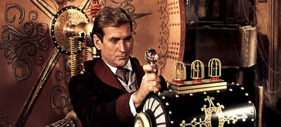
The protagonist in H.G. Wells’ novel The Time Machine travels fast forward in time, temporarily (!?) separating the passage of time in his own life from the passage of time in the world at large.  Of course, we cannot really do that either.

rod-taylor-time-machine_940x424

On the other hand …

Is Time Travel a Fantasy?
|No.  It just happens
|(whether we like it or not)
|on a fixed schedule.


The still from the 1960 film version of The Time Machine that appears here has been cropped to fit well on this page; it appears in an interesting post on TimidMonster.com.

humor, math, music

Like a Good Priest

I did not have pen in hand when a bemused radio announcer commented after playing Bach’s 4th Brandenburg recently, so the following quote may not be perfectly exact.  It is very very close.

How can anything so complicated and so mathematical be so beautiful?

Imagine a priest who hears one of the great settings of the Mass (or a tour of a Gothic cathedral) followed by

How can anything so complicated and so religious be so beautiful?

That is essentially how I felt.  With considerable effort, one could make enough dissonant noise to be as grating as the remark.  Scratch a chalkboard with the fingernails of one hand.  Bang on the cracks between a few piano keys with the fingers of the other.  Step on a cat’s tail and fart loudly.  Doing all that would suffice.

Amiens_Rose_Window_640x480

A good priest would redirect any shock or anger at the remark into sorrow and pity for the wayward soul of a heathen who meant no harm.  In this one respect anyway, I try to be like a good priest (or a good imam).

Selimiye_Mosque_640x427

Image Sources

Photos were downloaded from Wiki Commons and are used under Creative Commons licenses.

(BTW, the [Menu] button atop the vertical black bar reveals the widgets.)
birds, food, haiku, humor, seasons

Spring from Another Viewpoint

A few seconds near the end of the delightful music video from a CDHK episode have inspired a haiku that looks at a familiar subject from an unfamiliar viewpoint.
(BTW, the [Menu] button atop the vertical black bar reveals the widgets.)

I consulted the plants in my yard for my first response to

Carpe Diem Special #194
A Trip Along Memory Lane — with a twist
,

but I did not consult my plants this time.  They might be shocked.

Spring from Another Viewpoint
|One fat little bird
|welcomes spring in its own way.
|Cherry buds are food.

(reblog), humor, language, STEM

Narrative Starkness and Word of the Year

Kurt Brindley advocates “narrative starkness” that omits extraneous details about the characters in his fiction.  Apart from applauding Kurt’s starkness (and his ability to write humorous introductions for serious issues), the purpose of this post is to remark on a major difficulty with starkness and how the Word of the Year for 2015 may help.
(BTW, the [Menu] button atop the vertical black bar reveals the widgets.)

For reasons explained in the post excerpted below, Kurt Brindley advocates “narrative starkness” that omits extraneous details about the characters in his fiction.  Unless a character’s appearance (or gender or sexual orientation or …) matters to the plot, readers can imagine whatever they like.  Readers may later get a jolt if some details become relevant later and are different from their imaginings.  Maybe such a jolt will loosen the grip of a stereotype.

Apart from applauding Kurt’s starkness (and his ability to write humorous introductions for serious issues), the purpose of this post is to remark on a major difficulty with starkness and how the Word of the Year for 2015 may help.


My Uncolorful* Character(s)
Originally posted on
Kurt Brindley:

I don’t know about you, but as for me – unless it is absolutely critical to the movement of a story – I don’t need to always know every item in each room, or the style and brand of every shoe in the protagonist’s closet.

So it should come as no surprise then when I tell all you other reader dudes*** that I try to write my stories in the way that I prefer to read them: with limited and only absolutely necessary descriptive telling.

While I am very happy that DADT was finally axed and homosexuals are now allowed serve without any restrictions to their being, it was all of that nasty DADT stuff that became the impetus for me writing my novel.

And my goal in writing it was to force the reader to have to apply his or her own values, via perceptions and stereotypes, upon the characters in and events of the story.  Consequently, it was important for me as a writer to not tell the reader what I wanted them to think by way of character description, but to allow them to draw their own conclusions.

This equality stuff sure is a difficult nut to crack – witness the all-white Oscar nominees for this year’s Best and Supporting Actors/Actresses – and I’m not about to attempt to try and crack it here.

Except to say that screenwriters can certainly have a hand in keeping an open playing field for actors of all races and ethnicity by – you guessed it – laying off the descriptive details in their screenplays and leaving it up to the director to cast the best actor for the role based on the story’s content and need and not on the screenwriter’s biases.

*Yeah, I know “uncolorful” is not a real word, whatever a real word may be, but I it sounds less negative to me than “colorless” so, for what it’s worth, I’m going with it.

**gender specific

***non-gender specific

View original


Yes, “uncolorful” is awkward.  The aesthetic that urges omission of extraneous detail is well-established in STEM (as in “abstract algebra” or “Occam’s Razor”), but I cannot think of a good word or short phrase for wider advocacy of specifying only what really matters.  An “abstract” character is no more appealing than an “uncolorful” one.

It gets worse.  Writing smoothly and vividly but abstractly is tough.  George Orwell’s forever relevant 1946 essay Politics and the English Language includes a hilarious comparison between a memorable Bible passage and a translation into flabby blather that tries to make the general point w/o the concrete examples:

… the race is not to the swift, nor the battle to the strong, …; but time and chance happeneth to them all.

becomes

… success or failure in competitive activities exhibits no tendency to be commensurate with innate capacity, but … the unpredictable must invariably be taken into account.

In one way, a recent event may make narrative starkness a little easier.  The American Dialect Society’s Word of the Year award for 2015 went to “they” when used as a 3rd person singular pronoun that is gender-neutral.  I hope this usage sticks.

Suppose I want to write a story whose characters include a Navy sailor and a PhD scientist.  I could call them “Ensign Wood” and “Doctor Stone” to give them names that leave their genders unspecified.  But the old he-she-it gang gives me no appropriate pronoun to use.  Tho adequate in nonfiction writing, the clunky alternatives “he/she” or “(s)he” are hopeless in speech.  For my story, those pronouns may be making a misplaced fuss about being gender-neutral.  I can use “they” instead.  The ADS will have my back if grammar prigs attack.

It is nice to see that a humble pronoun has gotten the WOTY honor and may even help those who are fighting the good fight.  I have no appropriate haiku to end this post, but a limerick I read long ago does come to mind.

The function that’s nowhere defined
is an orange with only a rind.
But it turns up the hero
(like the null set and zero)
in many a proof you will find.

humor, photography, science, seasons, serendipity

Serendipity with Squid

Did I superimpose 2 images to create a (clumsy) visual metaphor about the interconnectedness of life?  Nope.  The story begins millions of miles away.  It ends on a window pane.
(BTW, the [Menu] button atop the vertical black bar reveals the widgets.)

HeronSquid_581x684Hmmm?  A ghostly translucent squid seems to hover in midair between the viewer and nesting herons.  No, I did not combine a heron image with a squid image in my photo editor.

The story begins millions of miles away, where the sun emits photons even more copiously than the pols emit factoids.  Minutes later, a tiny fraction of the photons bounce off a neighbor’s window, pass thru my window, and hit me in the eye.  There are many ways I would love to emulate people like Bach or Galileo; going blind is not one of them.

Yes, I could pull the drapes. But only a small portion of my window needs to be obscured.  Would rather not waste winter sunshine.  Yes, I could buy a window decal.  Most of the decals I have seen are cutesy.  The rest make a statement:

I am as ugly as a warthog with zits,
but the jerk who owns this dump
bought me as a decoration.  Ha!

Of course, I am dissing only the decals I have seen, not any other decal U may have and like.

The Dec/Jan 2016 issue of National Wildlife magazine has photos from the annual NWF photo contest, including a photo of nesting herons by Mario Labado and a photo of a squid by Jackie Reid.  I read the magazine on paper (yes, I am that old), and it so happens that the photos are on opposite sides of the same thin sheet, w/o much else to clutter what is seen when bright light passes thru.  The fraction of duplex printed sheets that look at all good when both sides are seen at once is like the fraction of photons emitted by the sun that bounce off my neighbor’s window:  tiny.

So I cut out the sheet and taped it to my window.  The image of the squid is actually on the far side; the illusion of being closer than the herons is the same in my house as in my photo.

The composite image is indeed clumsy as a visual metaphor for the interconnectedness of life, but it does tone down the excess sunlight.  It cost nothing beyond what I already spent to help support the NWF, and it looks better than a warthog with zits.

haiku, history, humor, politics

Long After the Sixties

When will things slide …

from liberty to anarchy?

from growing to shrinking?

from bravery to bravado?

from firmness to fascism?

from hope to rage?

The answer, my friend, has blown in on the wind.

The answer has blown in on the wind.

Fiscal Responsibility
|Debts rise; incomes fall.
|Hard times demand bold action:
|tax cuts for the rich!
 

baseball, flowers, haiku, humor, photography

Orange and Blue

The [Menu] button (atop the vertical black bar) reveals widgets like the Search box.  Typing just the [Enter] key into the Search box is a way to browse WordPress blogs.

orange-blue_938x337I had no interest in baseball during my misspent youth.  My late wife had some interest in it, her interest was contagious, and we had become casual fans of the NY Mets by the time they won their 2nd World Series in 1986.  With stamina unthinkable today, we saw the sights in Washington DC by day and watched much of the 1986 World Series by night, on the big TV in our motel room.  There were no games on the nights of travel days, but we managed.

While fans of the NY Yankees got to see many more wins over the years, Mets fans got to see more strategy because there is no designated hitter in the National League.  A great baseball team has an unusual combination of strategic leadership, individual initiative, and teamwork.  It is like a great army, but nobody gets killed.  Moreover, a not-great team can try again next year.

Tho definitely not a great team in most years, the Mets did and do have great colors: a strong orange and a strong blue, much like the colors in my photo.  Many fond memories of 1986 were refreshed by seeing orange and blue on a great postseason team in 2015, in addition to seeing them on foliage walks.

October is blessed with a riot of reds and yellows (and some persistent bright greens), as well as the glorious oranges of many of the sugar maples (Acer saccharum), some of the red maples (Acer rubrum), and NY Mets uniforms (but only in a few special years).  One color I seldom see in October is pink.  In 2015 I saw that also.

cactus_oak_888x504

Willful Cactus
|My “Christmas” cactus
|blooms whenever it pleases.
|Pink for Halloween!