Geometry began with practical measurements over moderate distances. Boundaries of Egyptian farmers’ fields had to be restored after the Nile’s annual floods. A taut rope between two posts marked where an edge of the base of a pyramid would be laid. And so on. This prosaic technology inspired ancient Greeks to create something weird and wonderful.
People like Pythagoras and Euclid reimagined the pyramid builders’ rope as perfectly straight (not sagging a little), so thin that it had no thickness at all, and extending forever beyond the posts. Crazy. They called it a “line” and found that they could reason about such things, proving new statements by deductions from what they already knew.
Those ancient geometers discovered much that was true and good and beautiful in the imagined world of points and lines, and a few of them took the first tentative steps toward using their discoveries to help answer questions about the experienced world of posts and ropes and much else. Eratosthenes kept the promise made by “geo”+”metry” when he measured the circumference of planet Earth, even tho it was impractical to try to wrap a tape measure around it.
Modern STEM is rooted in ancient geometry (among other things), and a long hard slog has progressed from measuring the Earth to understanding it. Our understanding is not perfect and never will be, but maybe it is good enough to help us save the Earth. From us. I hope we can rise to that challenge, and that I have risen to this one:
Geometry ~ Pic and a Word Challenge #269
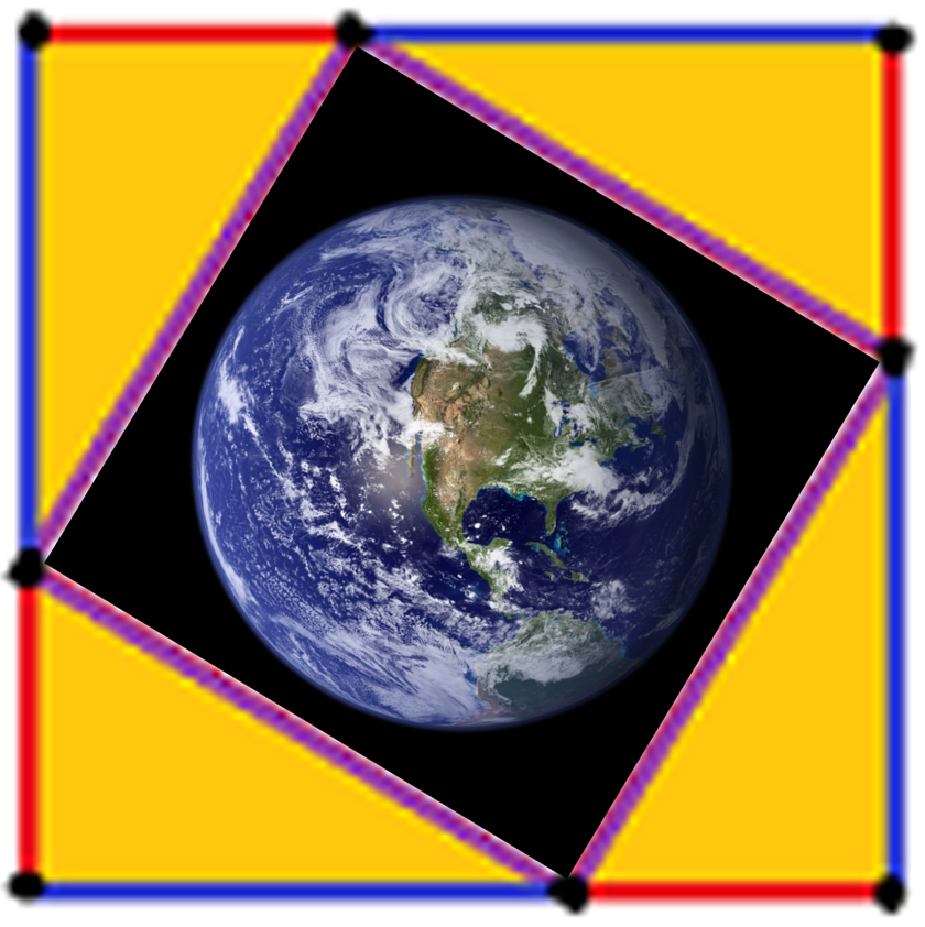
Image Sources
- The colorful frame around the image is upsized from my much smaller diagram for Bhaskara’s elegant proof of Pythagoras’ Theorem. The resulting fuzziness of the points and line segments is a reminder that we cannot experience the ideal perfection of geometric shapes. But we can refer to the shapes when we tell each other stories about what we experience! (Tho often hard to read w/o wrangling equations, scientific theories are among the best stories we can tell.) The colors of the line segments tie the image to the theorem’s bottom line w/o using letters that would clutter the diagram:
a² + b² = c²
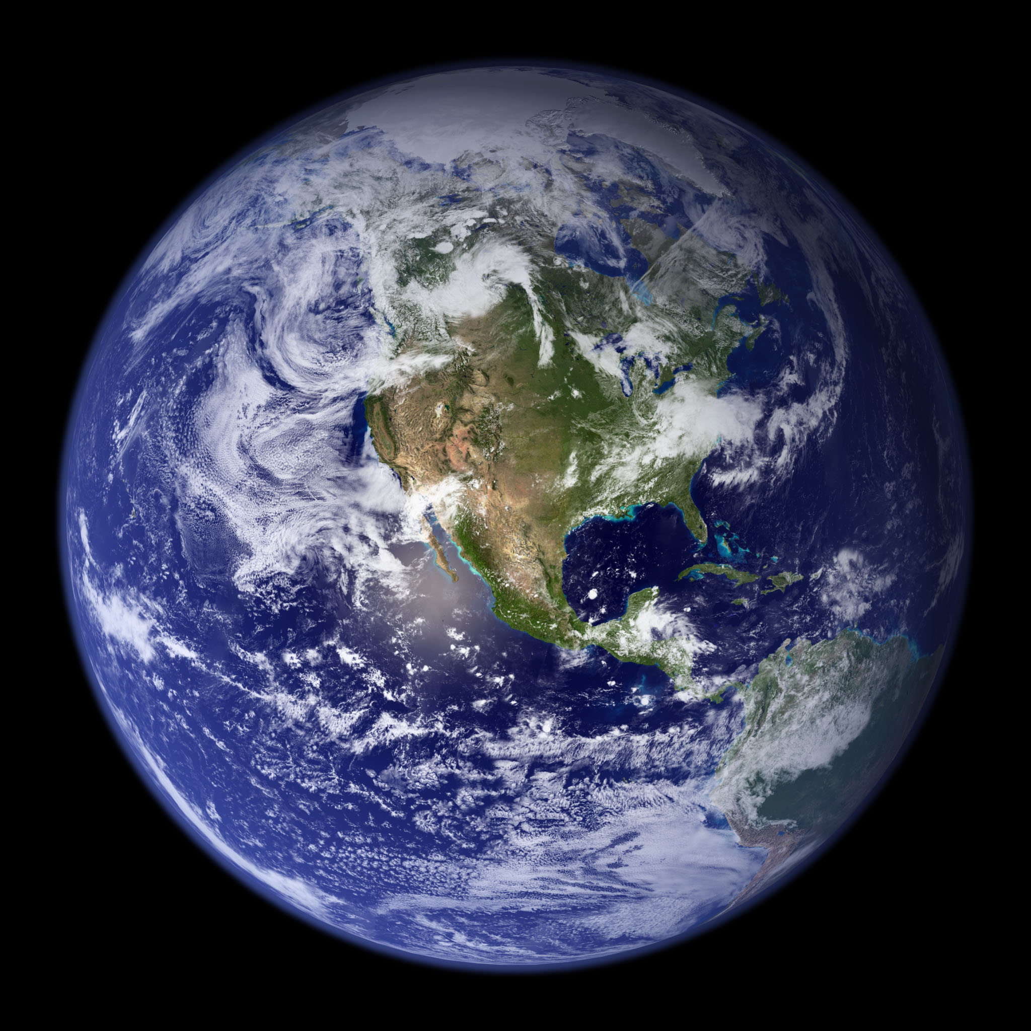
- The Blue Marble image overlaid on the diagram was downloaded from NASA Visible Earth: The Blue Marble. Making NASA’s image cost a lot more than making mine. That’s OK. It was money well spent.
– Gray button (upper left corner) reveals widgets, –
– above post (on phone) or beside it (on desktop). –

 No, wait. Look up toward the sky.


