Author: Mellow Curmudgeon
When He Pulls Strings
Dancer’s wooden mask:
leather hinges swing open.
Drum throbs; shaman chants.
~ ~ ~ ~
Hinges swing shut as dance ends:
hidden face; revealed spirit.

Photo © Trustees of the British Museum
~ ~ ~ ~
Khan Academy | Transformation Masks
– above post (on phone) or beside it (on desktop). –
Ornithocardiac Irony
Oak Tree Hymn
Show Case #2 (Writer’s Co-op)

Click here to see episode 2 of the Writers’ Co-op Show Case curated by Sue Ranscht, which begins as follows:
Catharsis
Those submissions are due by the end of Monday, November 1, 2021, and will be published here the following Friday. Please attach yours as a .docx, .doc, or .pdf to an email to stranscht@sbcglobal.net. (Guidelines: any genre, approximately 6 – 1,000 words.)
– above post (on phone) or beside it (on desktop). –
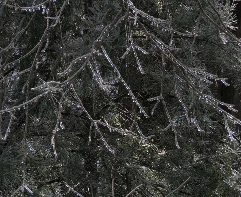
October Cloud
Sailing on fall wind,
a flock of droplets migrates.
Each is a small world.

Sailing ~ Pic and a Word Challenge #286
– above post (on phone) or beside it (on desktop). –
Show Case on Writer’s Co-op
Two on Mortality in 3-5-3
Emergent
from dancing atoms,
life is short.
Let’s live life
with defiant joy,
all the way.
Carpe Diem Haiku Kai … #1850 dried grass
“Dried grass” in the challenge comes from Basho’s last haiku, written as he was dying. My response imagines him rallying to console his grieving companions.
– above post (on phone) or beside it (on desktop). –
Layer Upon Layer
Smooth outer layer.
We see rough inner layer
when the light changes.
~ ~ ~ ~
Layers nest like Russian dolls,
when science shows us atoms.

Layers ~ Pic and a Word Challenge #283
– above post (on phone) or beside it (on desktop). –
To Age Gracefully … or Not
The REAL Thin Blue Line
Summer Compromise
Daylily & Chicory & Nat King Cole
Optimists, Some w/o Neurons
Henley’s Indomitable Trees
Trust, But Verify
– above post (on phone) or beside it (on desktop). –
Until recently, I used a desktop computer for all my online activities. I surrendered to modernity in 2021-05 and bought a smartphone with a stylus that would make hunt-and-peck typing tolerable in short stints. Now I use the new phone about 1% of my time online and have backup for coping with hazards like extended power outages.
Aware that many people do use their phones the way I use my desktop, I am careful to preview my blog posts as they would look on a phone. Previews cannot be perfectly accurate, but I leave some pixels of wiggle room whenever I want everything in a line of text on my desktop to appear as a single line on the narrower screen of a phone. The WP previewer displays a plausible phone rendering, and I change my draft as needed to make posts look OK on both desktop and phone.
Wanting to get used to my new phone w/o accidentally buying junk or installing malware, I installed my usual browser (Firefox) and browsed some familiar sites, including this blog. Oops. The fonts actually used were much larger than what I expected from the WP previews. My posts were awash in weird line breaks and required absurdly much scrolling.

© Evgenii Komissarov | 123RF Stock Photo
I tried the popular Chrome browser and found that it also rendered text much too big. After much thrashing around, I stumbled onto a simple way to make many of my posts look almost the same on my actual phone as they do in the WP phone preview. Many, yes. All, no. Here is a screenshot of part of a recent post as viewed in phone mode on WP from my desktop:

Here is the corresponding screenshot as viewed on the actual phone:

Yuck. After comparing the screenshots, I revised the post to avoid rogue line breaks (and demystify how to access my blog’s widgets) on a phone. Tentatively, I trusted the WP phone preview on my desktop. When the revision seemed ready to go live, I switched to the phone, tweaked the revision (by hunt-and-peck typing) as needed to work on the actual phone, and only then hit the [Update] button. Likewise with the [Publish] button for this post. Trust, but verify.
Is there anybody else who uses a desktop (or tablet) and has been blindsided by a clash between how things should look on a phone and how they do look? Here is the simple partial fix I stumbled upon. Us dinosaurs gotta stick together.
The [Appearance] item appears most of the way down in the menu on the left side of WP site pages. The click sequence
[Appearance]
[Customize]
[Fonts]
gave me a chance to change font sizes used to display posts.
Both [Headings] and [Base Fonts] had defaulted to [Normal] size. I set them to [Small]. While this might make text too small in some browsers on some desktops, I am sure that anybody using a desktop has already gotten used to pressing Ctrl-Plus or Ctrl-Minus as needed.