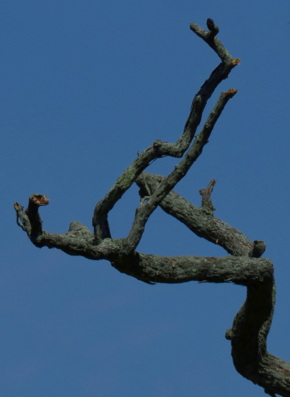
Bare Branches
Some go to grayscale
when form is “all” that matters.
I keep azure skies.
My world will gray soon enough.
I keep color and press on.
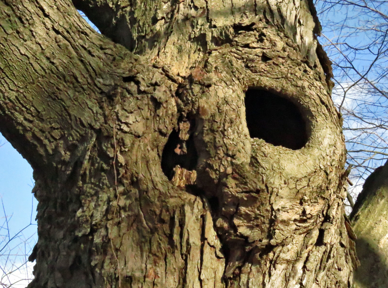
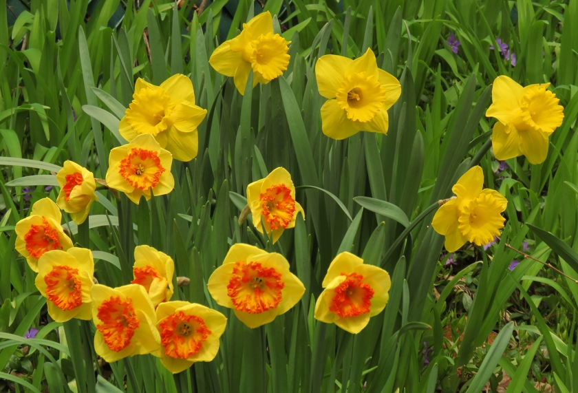
If somebody chooses to emphasize form and texture in a photo of bare branches by going to grayscale, I am likely to disagree with (but respect) that choice. So far, I have always wanted to keep color in my own photos, often with minor adjustments in my photo editor. Here are some examples where grayscale would be goofy:
| Click on a thumbnail to see the full image in another tab. | |
 |
 |
 |
|
While I have no qualms about really needing color in most of my own photos, there is more to be said about the ways various photographers have used color or grayscale. Some examples follow.
A somber poem with grayness as a metaphor has been illustrated by a photo of a mostly gray scene. But it is a color photo, and rightly so. The subtle color is a reminder that the grayness is there in the scene, not an artifact of how the image is displayed.
Of course, I admire the photographic pioneers whose images were compelling despite then-obligatory grayscale. Some classic photos are best left in grayscale anyway, and contemporary photographers may choose partial desaturation. There are even a few photos that benefit from going all the way to true black and white, where every pixel is either pitch black or stark white. Scroll down from the header image in Choices to see an example.