Unpacking groceries prompts me to salute a milestone in photographic history. Really. Nagging gourds and sexy peppers have a lot to say about kinds of progress and accepting responsibility for choices, in photography and beyond.
(BTW, the [Menu] button atop the vertical black bar reveals the widgets.)
§1: 2019-09-23
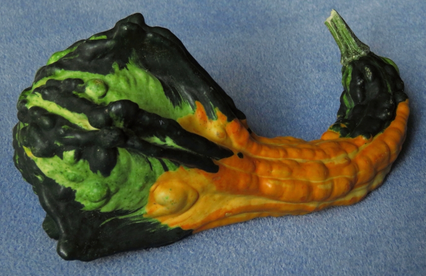
“Buy me!” says the wonderfully colored gourd. I refuse:
“No, I’ve already bought what I need for this year’s fall decorations. There’s no room for another gourd.”
“But I’m new and special. Look at the feathering between my greens.”
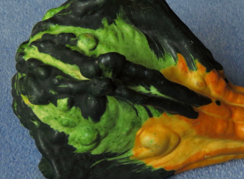
“OK.”
I put the gourd in the cart, check out, and drive home. As I unpack the groceries, I happen to set the new gourd down in a way that is vaguely reminiscent of a reclining nude. Then I recall a milestone in photographic history.
§2: 1927 — 1930
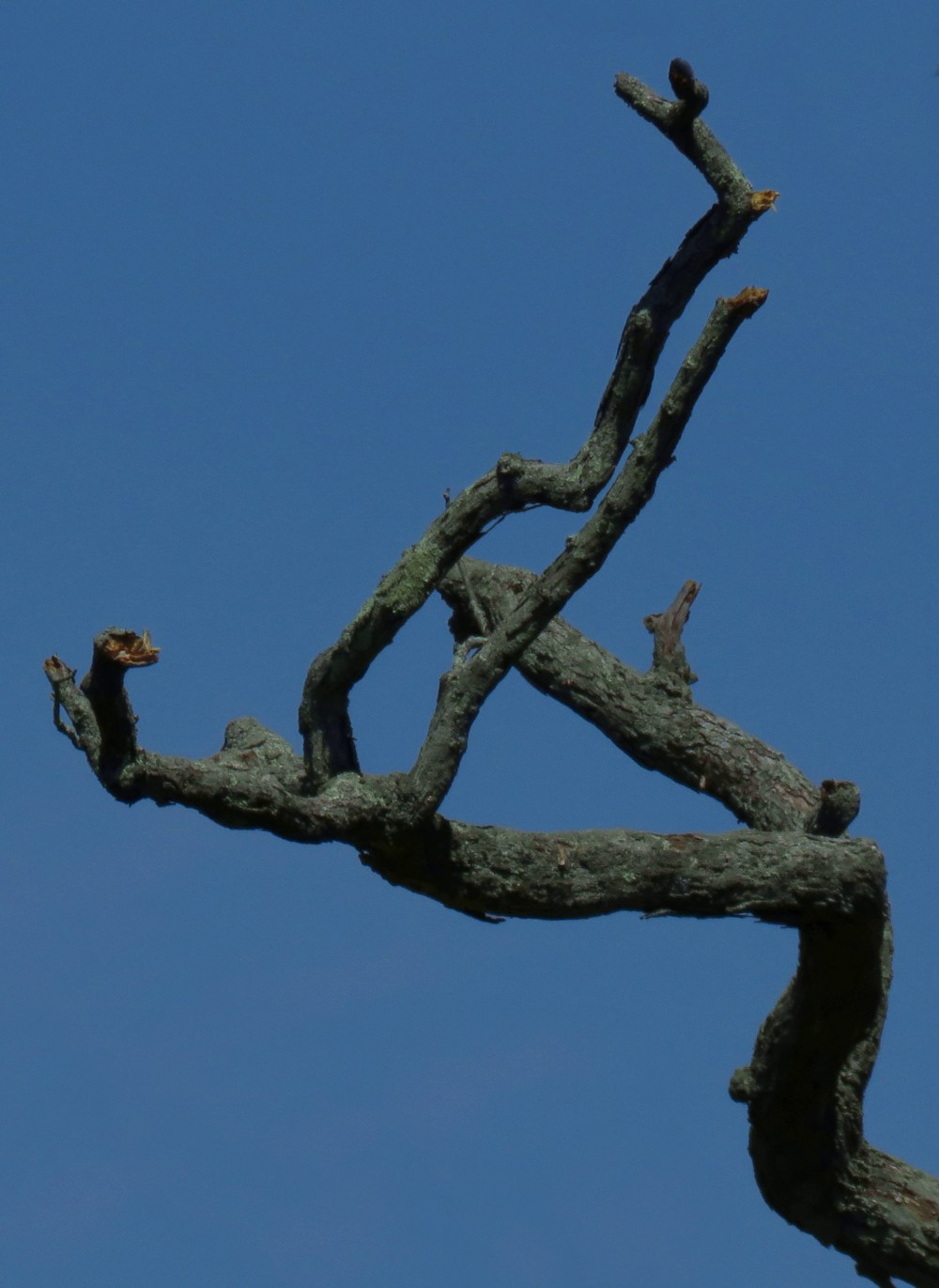
Edward Weston’s meticulous closeup photos of scores of common objects (notably bell peppers) are marvels of imagination and ingenuity. They also prompt one critic to remark that Weston’s peppers look like nudes while his nudes look like peppers.

Weston works in grayscale (aka “black and white”). The color of a pepper would only be a distraction anyway. While people have various skin colors, nobody’s skin is red or green.
§3: 2019-09-27
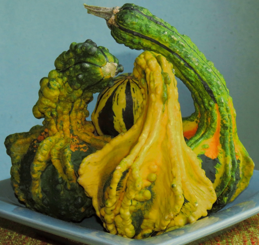
“Buy us!” say 3 colorful gourds. I refuse:
“No, I’ve already bought an extra gourd that I will use to salute Edward Weston.”
“Last year, U bought a total of 10. We’ll just bring it up to 8.”
“Last year’s gourds were smaller and came in bags of 5.”
“Weston bought more than 30 peppers.”
“But he could eat them when he was done shooting.”
“Puhleeze!”
“OK.”
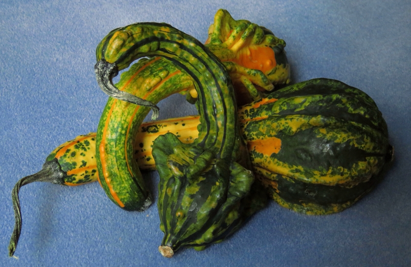
I’m a pushover. ¯\_(ツ)_/¯
§4: Now and Forever
Remember when cameras used analog film, color darkroom work was sorcery, and color prints faded under museum lighting? Artistic photographers had to work in grayscale. Viewers did not pine for color in the masters’ photos.
Sadly, some photographers mistook a temporary necessity for a permanent virtue. Wanna create a colorful image? Buy some tubes of paint. Stick with grayscale for artistic photography.
The sweeping general assertion of grayscale’s intrinsic superiority was a gross insult to Eliot Porter (and to all who hiked the trails he blazed in color photography).
Some photos do look better in grayscale than in color. Maybe something with interesting contours and textures happens to have distracting colors. Grayscale is great for Weston’s peppers.
Sometimes progress replaces an old thing with a new one that is all-around better, as in the transition from analog film to digital pixels. The transition from obligatory grayscale to color (in varying degress of saturation) is a subtler kind of progress that adds choices. Lots of choices.
Photo editing software supports having some color classes or parts of an image be more saturated than others. Done casually and obtrusively, it can be gimmicky. Done carefully and subtly, it can work with other edits to greatly improve a photo. One of the contemporary photographers I admire steps thru instructive examples:
What I Am Working On: Building Blocks
What I Am Working On: Fiddling
If U choose to desaturate a photo (either partially or all the way to grayscale), I may disagree with that choice. I will still respect it, but only as a specific choice. What I won’t respect is a blanket assertion that photos “should” be in grayscale. Or in color. Or have shallow depth of focus. Or have everything in focus. Or whatever.
Here is one blanket pronouncement that I do respect, in photography and beyond:
Don’t hide behind sweeping generalities.
Own your choices.