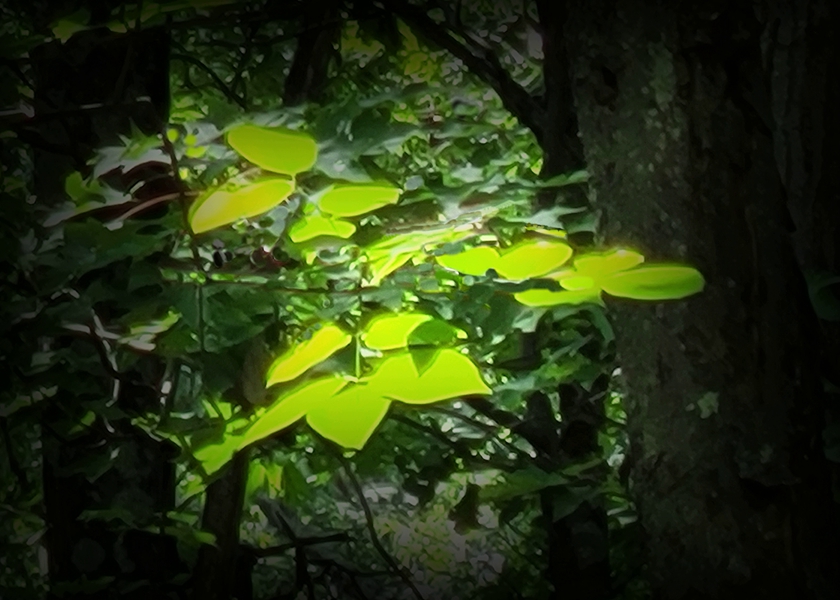
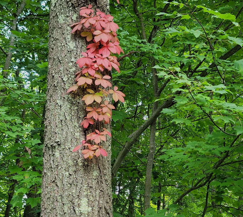
Thanks. It took a while to edit the first photo until it approximated the look and feel of what I saw. The second photo needed only some quick cropping.
In the Satellite theme of my posts, it is far from obvious how to get to widgets like Google Translate or the Search box. 😏
Yes, those two lines don’t add to the magic. I hope they don’t detract too much in the course of doing their job. Their current state is actually the latest of many iterations that deal with the tradeoff between intrusive and informative.
Thanks for prompting me to look more carefully at how a Reader default mangles my blog. In Reader’s list of recent posts, people who click on most places in an item will get Reader’s way to display that post. To get the way the author intended, the person reading often needs another click, such as on the [View original] button.
Reader’s default is OK for some blogs but disastrous for mine. The menu button explained in those “-” lines isn’t even there, and the lines are just as big as the lines of the poem. (With my actual formatting, the lines of the poem are much bigger, and the “-” lines have a different background.) Will delete the “-” lines. I still want people to see my posts with my theme and my formatting, not the Reader default; will work on how to encourage that. Maybe a “happiness engineer” can help.
Thanks for prompting me to look more carefully at how a Reader default mangles my blog. In Reader’s list of recent posts, people who click on most places in an item will get Reader’s way to display that post. To get the way the author intended, the person reading often needs another click, such as on the [View original] button.
Reader’s default is OK for some blogs but disastrous for mine. The menu button explained in those “-” lines isn’t even there, and the lines are just as big as the lines of the poem. (With my actual formatting, the lines of the poem are much bigger, and the “-” lines have a different background.) Will delete the “-” lines. I still want people to see my posts with my theme and my formatting, not the Reader default; will work on how to encourage that. Maybe a “happiness engineer” can help.
 Mellow Curmudgeon
I love your photos and your poems’ reflections on the seasons’ transitions…”to other drums.”
LikeLiked by 2 people
Thanks. It took a while to edit the first photo until it approximated the look and feel of what I saw. The second photo needed only some quick cropping.
LikeLiked by 2 people
Excellent!
LikeLiked by 2 people
Somehow the – Gray button and -above post do not seem to add to the magic of your otherwise rich verse.😂
LikeLiked by 1 person
In the Satellite theme of my posts, it is far from obvious how to get to widgets like Google Translate or the Search box. 😏
Yes, those two lines don’t add to the magic. I hope they don’t detract too much in the course of doing their job. Their current state is actually the latest of many iterations that deal with the tradeoff between intrusive and informative.
LikeLiked by 1 person
😉🤠
LikeLike
Ask a Happiness Engineer how to get rid of them. The AI ass-instant is just that: artificial, but WP’s HEs are terrific!🤠
LikeLiked by 1 person
Thanks for prompting me to look more carefully at how a Reader default mangles my blog. In Reader’s list of recent posts, people who click on most places in an item will get Reader’s way to display that post. To get the way the author intended, the person reading often needs another click, such as on the [View original] button.
Reader’s default is OK for some blogs but disastrous for mine. The menu button explained in those “-” lines isn’t even there, and the lines are just as big as the lines of the poem. (With my actual formatting, the lines of the poem are much bigger, and the “-” lines have a different background.) Will delete the “-” lines. I still want people to see my posts with my theme and my formatting, not the Reader default; will work on how to encourage that. Maybe a “happiness engineer” can help.
LikeLiked by 1 person
WP had a glitch that made this comment appear again. Sorry.
LikeLike
Thanks for prompting me to look more carefully at how a Reader default mangles my blog. In Reader’s list of recent posts, people who click on most places in an item will get Reader’s way to display that post. To get the way the author intended, the person reading often needs another click, such as on the [View original] button.
Reader’s default is OK for some blogs but disastrous for mine. The menu button explained in those “-” lines isn’t even there, and the lines are just as big as the lines of the poem. (With my actual formatting, the lines of the poem are much bigger, and the “-” lines have a different background.) Will delete the “-” lines. I still want people to see my posts with my theme and my formatting, not the Reader default; will work on how to encourage that. Maybe a “happiness engineer” can help.
LikeLiked by 1 person